Having grown up in Washington state, I find its western landscapes particularly compelling. I also may have inherited this opinion from my father, an architect and artist who has lived in Washington for most of his life. My father started doing art inspired by his home when I was still in grade school, and has developed a distinct style of landscape painting. Check out his (unadulterated!) artwork here.
When I got my first neural network running locally (using Torch and DeepStyle/neural-style described here on Ubuntu), I immediately wanted to use my dad’s artworks to inform the network’s filters, and to manipulate some actual photos of western landscapes that I have taken over the years.
I chose to start here, with a shot from eastern Washington state. This landscape is typical of my dad’s artwork; in my preliminary research and experiments with DeepStyle, I found that similar compositions with matching areas of light and dark led to better results and less visual confusion as the network renders features like horizon and foreground. More on that later.
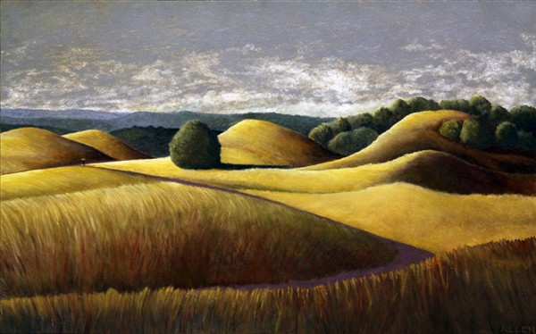
Summer Light: The Back Road to Neil’s Place (private collection). 15” x 24”, oil on panel
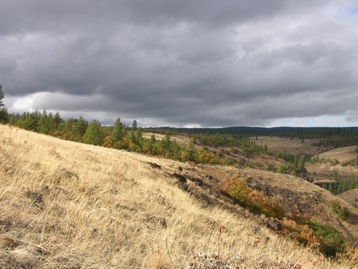
Ekone, from author’s snapshots
I chose to recreate the look of “Summer Light: The Back Road to Neil’s Place” on my snapshot. There are a number of visual similarities between the two images, such as rolling yellowish hillsides, green plants in the mid-ground, clouds in a gray-ish sky, and a dark green horizon line.
The default setup for DeepStyle includes 1,000 iterations, meaning that the network is refining the output 1,000 times before it thinks it is done. It gives you a sneak peek as it works by saving the output every 100 iterations. So, the first image I got to see after giving it the two images above was:
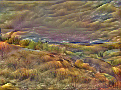
Well, that isn’t super attractive. It looks like a bad photoshop filter at 100 iterations, and the color seems pretty off. I’m hoping it gets better!
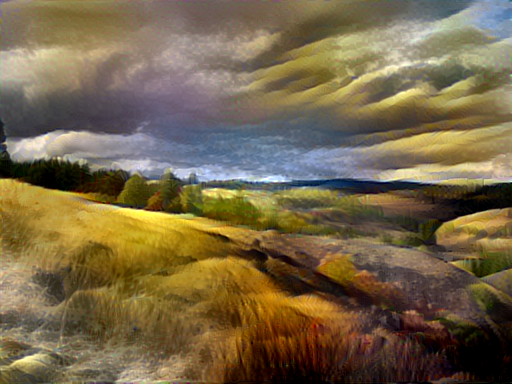
And the color is much better, and improving at 500 iterations, or halfway through…
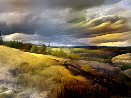
And it looks pretty nice in the end. You can see how the dark foreground in the right of the painting is coming through in the output image. I particularly like how the network has picked up on my dad’s use of texture and color in the vertical lines defining the grass in the foreground, and I wish it had taken this further. Lastly, and I think most successfully, the network has correctly identified and applied color and shape to the undulating, saturated yellow ocher hills, and the shape and color of the vegatation looks like an excellent forgery for my dad’s style of rendering.
So that was a pretty successful result. What about some less successful attempts?
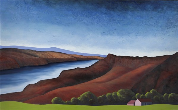
Reclamation, 48”H x 64”W, 2012, oil on panel
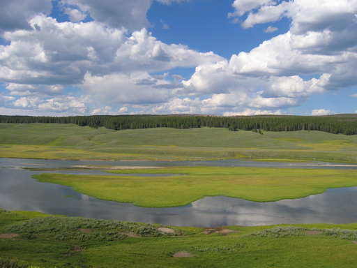
Yellowstone, from author’s snapshots
They both have some water features, and a blue, blue sky, but these are very different images without the similarities we had with the previous pair.
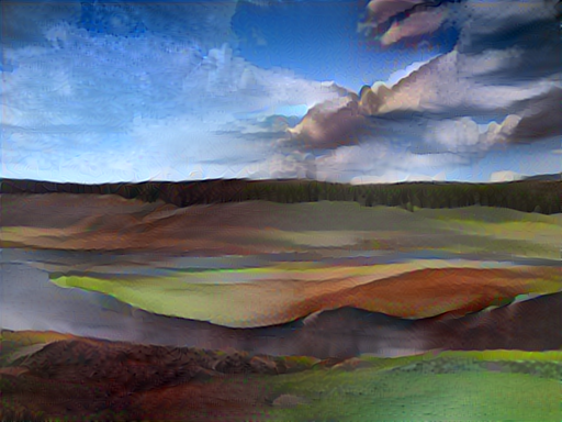
This one did not come out as well. The network has made some interesting color choices throughout, and the clouds look pretty cool. It is interesting how you can see visually the network identifying areas of similarity and contiguousness (the water in the foreground, the area of green land seperating it). It does a pretty amazing job at that, even as it muddies it up adding the dark red areas from the painting to the photo.
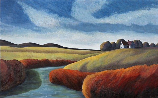
Deliverance, 30”H x 48”W, 2012, oil on panel
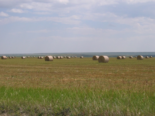
Hay Bales, from author’s snapshots
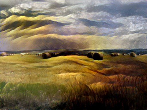
Oh, this one is even worse! Another incongruous set of images leads to another murky result. The network has gone really off the rails on the sky, which looks like mountains, but like nothing from either source image. Some of the vertical texture in the foreground looks nice (and similar to the first image we did), but the darkness in the mid-ground center of the image and at the bottom right are really unattractive. I’m also not surprised that the network did some weird things with the architecturally rendered little white house from the original painting. It seems like that angularity and color is sort of dotted at a small scale along the horizon of the output image, but it’s not a very good translation.
So let’s go back and look at the photo “Ekone” again.

Ekone, from author’s snapshots
That one seemed close in composition to many of these artworks, and gave a pretty nice result. I wonder how that same photo might look filtered by other paintings.
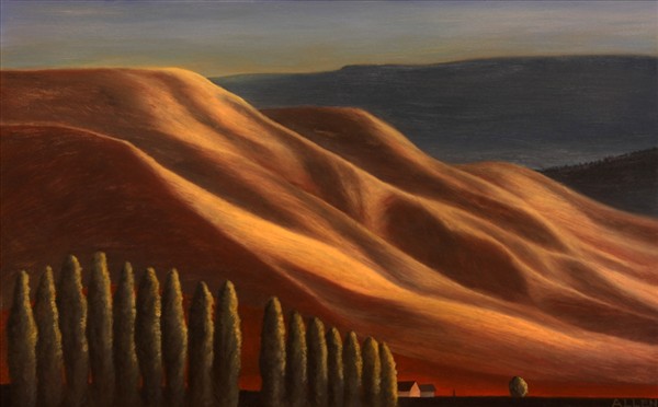
Autumn Light: The Heights, 15”H x 24”W, oil on panel
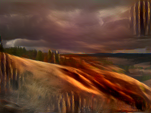
Well that’s certainly vivid. It’s a pretty nice rendition, actually. The vertical lines created by the trees in the original painting have come through, but in a weird place - up in the corner where the sky is. The sky apart from that looks nice, though, and the strong color and dimension of that sloping left-to-right hillside really comes through well.
So what if I went back to the painting “Deliverance”, and put that on Ekone? Well, “Deliverance” has a hillside on the right of the image, and Ekone has a hill in the foreground over on the other side. Those mismatching areas of light and dark and the confusion it creates for the network about where to render the horizon line seem worth avoiding. I wonder though… what if we cannibalized my dad’s artwork and just… flipped it? So that the general shape of each image better lines up?
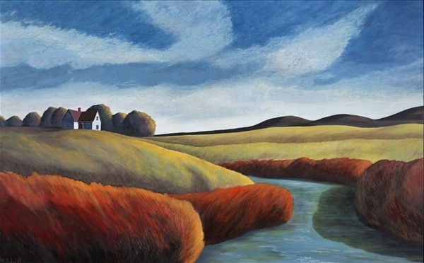
Deliverance, 30”H x 48”W, 2012, oil on panel (flipped horizontally by author)

Ekone, from author’s snapshots
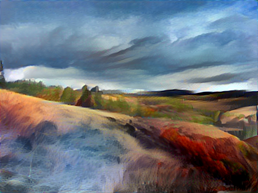
Although this is sort of a technicolor nightmare, I like it best of all my outputs. The color and shading of the sky look really nice, although I prefer the rendering of vegetation in the fore- and mid-ground that we got on our first attempt (Summer Light x Ekone). I am really excited to see that the network has interpreted the hard near-horizontal line of rock in the far right mid-ground of the Ekone photo as a house, and has somewhat rendered it in the architectural style of the building in the “Deliverance” painting. This might disprove my “flipping” strategy a bit, as on the flipped “Deliverance”, that house was way off to the left as opposed to the far right. Maybe if they were closer, the network would have rendered the house more cleanly and more true to the light color in the painting, or maybe it would have correctly identified that area of the photo as not a house at all!
Next Steps?
Absolutely more testing and tinkering and trials are required. I have not even begun to dig into all the tweaks one can make to how this neural network works, and I look forward to becoming more of a power user. I need to work on speeding the rendering process up, or at least writing some bash scripts so it can automatically render a batch of images overnight (I’m using CPU power only, having been scared off of trying to get my video card involved. I only bricked up my Windows install once on this project, but I wasn’t eager to repeat the experience). I’ve been putting some images with people through the network, and those are coming out alternately terrifying and interesting. I’m excited about the possibilities for game art, too.
I’m excited about playing with this tool to gain a better understanding of what it is my neural network is doing and thinking and feeling: http://playground.tensorflow.org/
And I’m very jazzed about this talk coming up at PyGotham next month, which I’m hoping will be a place for me to leverage my programming knowledge against this neural network tool.
